
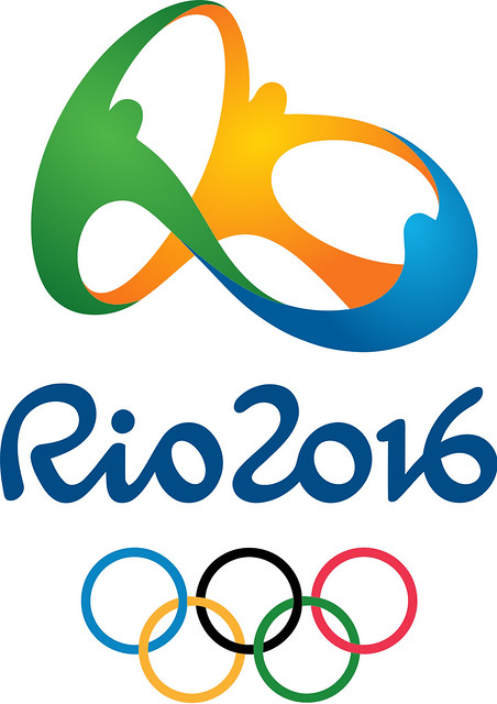
For this category, I'll be following Eye Magazine's design blog and regularly commenting on their content. What caught my eye this week, pun not intended (because puns are lazy), was their commentary on the Rio de Janeiro 2016 Olympic Games logo. I might still be bitter that Rio inexplicably beat out Chicago (my hometown) for the 2016 games, but I tend to agree with Eye's analysis. They call it "so nondescript that it's difficult to concentrate on it long enough to form an opinion."
The problem is that it could be a logo for any number of companies and uses no form of visual shorthand to suggest the vibrant culture of the city, country and continent. If anything, it's simply reflective of the state of logos in general. Many logos are being redesigned in a more complicated, computer-display friendly style that detracts from the simple beauty and graphic nature of earlier logos intended largely for print media (Given my work in custom publishing at the university bookstore, the Xerox logo change comes to mind immediately as an example of this).
I can't wait to read your posts on movie poster design, and I personally think it could make an excellent career for you. If you haven't already, check out Kellerhouse (http://www.kellerhouse.com/). Remember the "I'm Still Here" poster? We have Neil Kellerhouse to thank!
ReplyDeleteI absolutely LOVE Olympic designs. One of the first comments I had when the olympics happened last winter was about how much I loved all the different icons for the sports. Every season the overall design is so amazing. In fact, after seeing the icons you created for spring preview, I was reminded of the Olympic icons!! It was great working with you this past weekend!
ReplyDelete