Wednesday, January 26, 2011

Response - Week 1


Don't look down — there aren't any jobs there, either.

Although I know this response is supposed to be to something that happened in the Advanced Magazine Design class, I feel that my subject is related closely enough that it merits discussion. Representatives from a few of Meredith's many publications visited the class and held a Brown Bag discussion about finding jobs immediately beforehand that was open to the entire magazine department. Let it be known that my greatest concern in this and every other waking moment is how and when I will secure post-Columbia employment. Ideally, I would be working for a magazine based in New York and earning a livable wage. Coming back to reality, I know that if I'm lucky, I'll reach that point a few years down the road. For the time being, I'll be ecstatic if I can have two out of three.

What the Meredith reps explained was at times both alarming and reassuring (80:20 ratio, give or take). They said that we should expect to work unpaid out of college (something I probably cannot afford for any serious duration), and that finding jobs in the magazine industry is largely about connections. Fortunately for me, I chose wisely with the University of Missouri, which is a name in itself that seems to function as a connection, not to mention any faculty (ahem) connections who might know somebody (in New York) who knows somebody (in Chicago) who knows somebody (in Fairbanks) who might be hiring somebody (after a three-month probation period). Another small confidence boost came in Maggie Meyer's explanation of why she was hired. She said that she is a designer who thinks like an editor, and although I hate to toot my own horn (commence tooting), I think that description fits me and my resume as well.

At the end of the day, the Brown Bag did little to assuage my paralyzing fears about life after mid-Missouri. I still feel like I'm tied up and slowly being lowered into a pit of molten steel (or into a pool of sharks with lasers attached to their heads). I suppose, though, even if I can't find a paying job immediately, I'll survive. After all, there were two more Terminators and three more Aliens.

Critique - Week 1


Admittedly, I did not commit as much time to this feature as I would have liked, and my first priority if I'm going to produce excellent design work is to manage my time better. The difficulty in this photo story was finding a balance between the hook, which is that it's a story about a 2-year-old girl in beauty pageants, and the actual content, which is a very touching story about a father's devotion to his daughter. It doesn't have any of the trappings of abusive parent-child beauty pageant relationships, and I was surprised by how beautiful it was. In the end, I took the safe route and skewed toward the frilly aesthetic that immediately relates beauty pageants rather than trying to tell the father's story better through the peripheral design elements beyond he photos themselves. I found the first two photos I used to be the strongest of the bunch, but I didn't have a sense of how to really wade through the rest of the photos. The last package speaks well to the pageant setup with the beauty queens, trophies and runways, but it is also probably a bit generic for the story. The second spread, I feel, addresses the father's devotion not only to his daughter but also to helping her through the pageants. He doesn't simply love her, he takes an active role in this activity, which is rare.


For the cover, I debated about the usefulness of several of the photos. I strongly considered the photo I used for the opening spread of the feature, but giving it the square crop required for the cover destroyed all the empty space in the photo that beautifully isolates the two focuses of the story. Eliminating that space would have ruined the photo, I feel.

There is another photo that I ended up not using at all of Ellie, the little girl, bawling. It appealed to me for a few reasons. Primarily, it would create a hilarious juxtaposition with the headline "Isn't she lovely" that would fit with Vox's frequently more cavalier tone. Furthermore, crying babies on the cover are probably going to draw more people than a row of trophies. I also felt that it was an idea that few people if anyone would have, which would give it that elusive hint of originality. Unfortunately, what it had in originality, humor and shock value it lacked in content-driven design. The story is not about how  unpleasant baby beauty pageants can be, but rather how strong a father's love of his daughter is.

I liked the photo I used as the lead in the second spread as well because when placed on the cover it reflected the father's support of his daughter. Again, crop issues became a problem as it was not shot specifically for the cover, and it seemed too involved a photo for newsstand recognition.

As it unfolded, I somewhat begrudgingly chose the straightforward photo of Ellie with her tiara and her trophy. At the very least, I felt it conveyed the broader subject of baby beauty pageants. It is also beautifully composed for Vox's cover shape and headline placement. It is also the cleanest photo, and it lacks any distractions that might confuse the eye upon quick glance. It is certainly not the most compelling photo, but it is very nice and worked well for the cover.

Don't Miss This vol. 1


For this category, I'll be following Eye Magazine's design blog and regularly commenting on their content. What caught my eye this week, pun not intended (because puns are lazy), was their commentary on the Rio de Janeiro 2016 Olympic Games logo. I might still be bitter that Rio inexplicably beat out Chicago (my hometown) for the 2016 games, but I tend to agree with Eye's analysis. They call it "so nondescript that it's difficult to concentrate on it long enough to form an opinion."

The problem is that it could be a logo for any number of companies and uses no form of visual shorthand to suggest the vibrant culture of the city, country and continent. If anything, it's simply reflective of the state of logos in general. Many logos are being redesigned in a more complicated, computer-display friendly style that detracts from the simple beauty and graphic nature of earlier logos intended largely for print media (Given my work in custom publishing at the university bookstore, the Xerox logo change comes to mind immediately as an example of this).


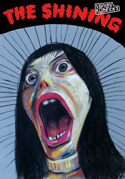
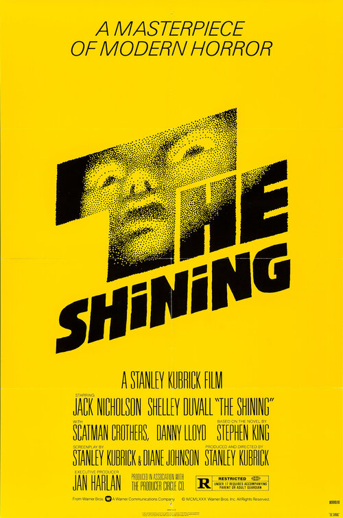
In addition to Eye, I'll also be looking at various items of note that strike my design fancy. Being obsessed with film and especially movie posters, Polish movie posters are something that I have always found totally fascinating. By and large, American movie posters have degenerated into a soulless money-grab where there's little artistic style and more about the immediate conveyance of genre and names rather than the content of the movie. (Iron Man comes to mind.) All that said, Polish movie posters continue to amaze me. The website where I most frequently ogle these advertising marvels is www.polishposter.com, where they feature several different artists with wholly unique styles. The example on the right is for one of my favorite movies, Stanley Kubrick's The Shining. The visual style is a wholesale departure from the yellow typographic design of the original poster, which I also love but is considerably less indicative of the movie's content (in my opinion).

Allow myself to introduce ... myself


My name is Aaron Channon, and I am currently Art Director of Vox Magazine. I have been in this role since August of last year, and before that I was a department editor, occasional contributor and reporter — in that order. I graduated from the MU School of Journalism (naturally) in 2010 with a degree in Magazine Editing (technically), but I prefer design because it is about breaking limitations more often than making them. So, even though I'm half-art, half-words, I would like my future to lie in design.

The original name of my blog was supposed to be "I now pronounce you man and pen tool," but it was casually suggested that it might not be the most professional option. As it is, I've chosen "Design and Conquer" both because it's clean and clever, but also because it reflects the importance of design. That is, you can in fact conquer through design. As magazine designers, we have full control over how a story reads even though we frequently do not write any of the words.