Thursday, April 21, 2011

Critique - week 13

This week I won the cover competition by default after Theresa and Michelle both designed for 30 under 30 (and did a totally incredible job) and Tova won the True/False cover competition. Because we were extremely limited by photo options, I ended up trashing my initial idea because we didn't have the photos to support it and played with several other options before settling on the one pictured below.


I think what resulted was a pretty happy solution to the problem. (The problem was that the subjects of the stories, who are police officers, did not want to be photographed in uniform (with one exception) because they don't work in uniform. Furthermore, the photographers only shot extremely low-key photos of the officers, which did not allow for a great deal of flexibility.) Because the story was slugged "Faces of the Force" and was a set of profiles of five police officers, it seemed necessary to opt for photos of them rather than an illustrative option. The cover that will run in print tomorrow is a marriage of the two options that does not over-emphasize the dark, grittiness of the actual photos.

Incidentally, even though I like the cover, I'm most proud of beating out 25 editors for both the cover and feature headlines (and two of the sell lines!).

Wednesday, April 20, 2011

Response, week 13

So I've been working on my (not-so-)mini portfolio for what feels like forever now, and it's almost done. Given our discussion about printing them recently, I thought I'd share some of what I'll be doing.

Here is my cover:

This incorporates my personal branding, which extends to this blog, my (future) portfolio website, my resume, business cards, personal letterhead, etc. It felt pretty vain at first to devote all this time to branding, but if it will help me stand out and get a job, I suppose I can't complain. Just to clarify the above image, it is set up to print on the Espresso Book Machine (though I cropped the bleeds). As such, it is set up in landscape with the back cover (left) and front cover (right) as well as the spine in a single document.

The branding style established here is scaled back within the actual portfolio pages, which incorporates Trade Gothic Bold but does not use the apple logo so as to avoid distracting from the designs within the book. That said, the branding idea, which is meant to suggest skill with both words and art, will be fully realized on my website. I plan to expand upon the "A is for Aaron" rather than "A is for Apple" idea by executing the same idea but with Bio, Contact, Design, Editing and Film sections — the alphabet was very helpful to me there. For example, in B is for Bio, there might be a banana that you peel to reveal information about me. In C is for Contact, I'm envisioning a cat sitting at a computer typing an email with active an active link that allows you to email me.

I know this whole thing sounds pretty hokey right now, but I think I can execute it well enough that (what I think is) the clever thought process will come through. As for size, the book is 7.5" wide by 8" tall, which I chose to accommodate the shape of Vox pages. As the cover suggests, I will be including editing and writing clips as well as design clips because I feel each area is strong enough to warrant it.

Wednesday, April 6, 2011

Response - Week 11

I think at this point, we're all sort of pushing with brute force to the press date of our individual magazine prototypes. So, at this point, I'm not sure there's much I can change about Cupboard. My publishing group is intelligent — I know this from working with a few of them on other projects — and my co-designers are all very skilled in important ways. The original concept was to provide a magazine that helped readers save money and prepare meals for fewer people, which I thought at the time was smart because a) people always want to save money and b) recipes are frequently not cost- or quantity-efficient. The concept for the magazine started going down the wrong path once it was decided (note the passive — no one's to blame, obviously) that Cupboard should not appeal to a niche audience. The publishers refused to buy in to the concept fully and instead most of the stories are a collection of ideas that fit into the magazine rather than stories written specifically for the magazine, if that makes sense. That is to say, I feel the stories are curated from stories that have run in other magazines that fit into the mission of the magazine. It would be better if the magazine had a clear mission and bought into it wholly. For example, we have a story called Can it! that suggests people in our target audience would be interested in home-canning (despite the name of the magazine, the target audience is younger people around 20-35). A better idea would be to give recipes you can make only with canned food, but that would not appeal to everyone in the country, just most of the people in our target audience. There is an aversion to feeling cheap, which I understand, but I think an acceptance that people in this audience are overworked and underpaid and don't have time to create immaculate meals doesn't equate to cheapness. What could have been a useful and exciting magazine prototype has ended up pretty uninteresting.

That's just how I feel.

Critique - Week 11

(I know they're not all sans serif.)

For the typography project, instead of going out and finding type, I decided to stay in an further explore the type that surrounds me every day. These are a few of the movie posters that I have hanging in my apartment, and I frequently use them for inspiration. They are (in order) À Bout de Souffle (Breathless), Black Swan, Manhattan, Snatch, Splash, Cool Hand Luke, Vertigo, Gilda and Fargo. I blew up the selected letter and removed the rest of the type on the poster to emphasize the single letter style in the context of the other art elements of the poster. I very much like how it turned out, but that's probably because I love all the posters (perhaps with the exception of Splash. I only like Splash.)

You Can't Miss This, vol. 9


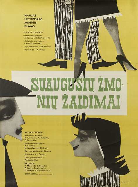
This week, Eye provided me a gold mine of Lithuanian movie posters, which I had never seen before, but I love them. They remind me a lot of Polish movie posters, which I expressed my unending love of here. I like these posters for many of the same reasons I love the Polish posters. They're not limited by the money-grabbing limitations that American movie posters are, and therefore the studios don't impose requirements on the relative head size of actors and so on. I also really enjoy foreign movie posters in general because I don't know the language, and that lets me see the typography in the context of the art without processing the meaning of the words. Compounding this, foreign movie posters frequently use type that is more interesting and less standardized than American movie posters, so it is much more compelling.


My friend Ross showed me this a few weeks ago, and it's just incredible. I love looking at the progression of titles, and pinpointing where the video-makers felt compelled to suggest a change in styles of movie titles. To me, it seems apparent that there's a dramatic change when Saul Bass starts designing titles in the mid '50s, and I don't think that's just my personal preference for his work. After his work with The Man with the Golden Arm, Anatomy of a Murder, Psycho, North by Northwest and Vertigo, movie titles change dramatically. They are no longer type and art but kinetic and meaningful elements of the film. That is not to disparage the early ones — they are excellent as well (particularly Citizen Kane and The Thing) — but Saul Bass is clearly a game-changer here.

Speaking of Saul Bass, my coworker Andrew (upon my discussion of Saul Bass at work) sent me this link. It shows several of Bass' more enduring logos, which have an average life span of 34 years, according to the blog post.

Wednesday, March 16, 2011

Don't Miss This — Week 8


In Eye this week, one of their bloggers provided coverage of Royal College of Art poster exhibition called "British Posters / Affiche Françaises" in which British and French graphic designers created poster advertisements or responses to these posters. Specifically, the British designers created responses to the French designers' posters. The takeaway from this (one of the takeaways, really), in my opinion, is that advertisements can be beautiful. We know this, and as magazine designers I think many of us wish we had all the freedoms that advertisers have (or seem to have. The grass is always greener, isn't it?). I am reminded of an advertisement we discussed in my Strat Design and Visuals class. It is pictured below:


The ad is part of an integrated print and video campaign that is centered around this melting idea. The professor really admired this ad, and many of my classmates were also very impressed. It is obviously a marvel of technical execution, and the idea is very thoroughly shown throughout the ad, but it just seems muddled to me. Looking through a magazine, I'm fairly confident this ad would not stop me. It's over-the-top and gaudy in the same way that the fashion ads that litter magazines are. They're lovely to look at, but they all run together. The posters presented in the French/English exhibition, however, are exciting and eye-catching. They just appeal to me more.

Tonight at the Student Center, the Missouri Student Association held a cake decorating competition with guest judge Duff (Ace of Cakes) Goldman (!!!). I was pretty skeptical about how the cakes would turn out, but on my work break, I had a chance to look at them, and they're really impressive. Check out some photos in the Missourian's coverage of the event, courtesy of photographer Madeline Beyer. I'm always impressed by people who can make beautiful things with their hands rather than on a computer screen.

Response, week 8


You'll have to move swiftly to get your hands on a design job

Finding a design job feels sort of like the world's largest game of Whack-a-Mole; the jobs pop up when you're least expecting it, and they're only around for a very short time. That's how it feels, anyway.

That said, I am in the process of putting together my portfolio book to ship off to prospective employers, so this past week's group portfolio review has been helpful (and will be even more helpful when I can get my hands on those written critiques). The entire process has me outrageously stressed, but finally sitting down and picking out which pieces make the cut has alleviated a small portion of that stress. I am finally moving forward with all the preparations for applying to jobs and internships (the March 21 National Geographic deadline is also pretty good motivation).