Thursday, April 21, 2011

Critique - week 13

This week I won the cover competition by default after Theresa and Michelle both designed for 30 under 30 (and did a totally incredible job) and Tova won the True/False cover competition. Because we were extremely limited by photo options, I ended up trashing my initial idea because we didn't have the photos to support it and played with several other options before settling on the one pictured below.


I think what resulted was a pretty happy solution to the problem. (The problem was that the subjects of the stories, who are police officers, did not want to be photographed in uniform (with one exception) because they don't work in uniform. Furthermore, the photographers only shot extremely low-key photos of the officers, which did not allow for a great deal of flexibility.) Because the story was slugged "Faces of the Force" and was a set of profiles of five police officers, it seemed necessary to opt for photos of them rather than an illustrative option. The cover that will run in print tomorrow is a marriage of the two options that does not over-emphasize the dark, grittiness of the actual photos.

Incidentally, even though I like the cover, I'm most proud of beating out 25 editors for both the cover and feature headlines (and two of the sell lines!).

Wednesday, April 20, 2011

Response, week 13

So I've been working on my (not-so-)mini portfolio for what feels like forever now, and it's almost done. Given our discussion about printing them recently, I thought I'd share some of what I'll be doing.

Here is my cover:

This incorporates my personal branding, which extends to this blog, my (future) portfolio website, my resume, business cards, personal letterhead, etc. It felt pretty vain at first to devote all this time to branding, but if it will help me stand out and get a job, I suppose I can't complain. Just to clarify the above image, it is set up to print on the Espresso Book Machine (though I cropped the bleeds). As such, it is set up in landscape with the back cover (left) and front cover (right) as well as the spine in a single document.

The branding style established here is scaled back within the actual portfolio pages, which incorporates Trade Gothic Bold but does not use the apple logo so as to avoid distracting from the designs within the book. That said, the branding idea, which is meant to suggest skill with both words and art, will be fully realized on my website. I plan to expand upon the "A is for Aaron" rather than "A is for Apple" idea by executing the same idea but with Bio, Contact, Design, Editing and Film sections — the alphabet was very helpful to me there. For example, in B is for Bio, there might be a banana that you peel to reveal information about me. In C is for Contact, I'm envisioning a cat sitting at a computer typing an email with active an active link that allows you to email me.

I know this whole thing sounds pretty hokey right now, but I think I can execute it well enough that (what I think is) the clever thought process will come through. As for size, the book is 7.5" wide by 8" tall, which I chose to accommodate the shape of Vox pages. As the cover suggests, I will be including editing and writing clips as well as design clips because I feel each area is strong enough to warrant it.

Wednesday, April 6, 2011

Response - Week 11

I think at this point, we're all sort of pushing with brute force to the press date of our individual magazine prototypes. So, at this point, I'm not sure there's much I can change about Cupboard. My publishing group is intelligent — I know this from working with a few of them on other projects — and my co-designers are all very skilled in important ways. The original concept was to provide a magazine that helped readers save money and prepare meals for fewer people, which I thought at the time was smart because a) people always want to save money and b) recipes are frequently not cost- or quantity-efficient. The concept for the magazine started going down the wrong path once it was decided (note the passive — no one's to blame, obviously) that Cupboard should not appeal to a niche audience. The publishers refused to buy in to the concept fully and instead most of the stories are a collection of ideas that fit into the magazine rather than stories written specifically for the magazine, if that makes sense. That is to say, I feel the stories are curated from stories that have run in other magazines that fit into the mission of the magazine. It would be better if the magazine had a clear mission and bought into it wholly. For example, we have a story called Can it! that suggests people in our target audience would be interested in home-canning (despite the name of the magazine, the target audience is younger people around 20-35). A better idea would be to give recipes you can make only with canned food, but that would not appeal to everyone in the country, just most of the people in our target audience. There is an aversion to feeling cheap, which I understand, but I think an acceptance that people in this audience are overworked and underpaid and don't have time to create immaculate meals doesn't equate to cheapness. What could have been a useful and exciting magazine prototype has ended up pretty uninteresting.

That's just how I feel.

Critique - Week 11

(I know they're not all sans serif.)

For the typography project, instead of going out and finding type, I decided to stay in an further explore the type that surrounds me every day. These are a few of the movie posters that I have hanging in my apartment, and I frequently use them for inspiration. They are (in order) À Bout de Souffle (Breathless), Black Swan, Manhattan, Snatch, Splash, Cool Hand Luke, Vertigo, Gilda and Fargo. I blew up the selected letter and removed the rest of the type on the poster to emphasize the single letter style in the context of the other art elements of the poster. I very much like how it turned out, but that's probably because I love all the posters (perhaps with the exception of Splash. I only like Splash.)

You Can't Miss This, vol. 9


This week, Eye provided me a gold mine of Lithuanian movie posters, which I had never seen before, but I love them. They remind me a lot of Polish movie posters, which I expressed my unending love of here. I like these posters for many of the same reasons I love the Polish posters. They're not limited by the money-grabbing limitations that American movie posters are, and therefore the studios don't impose requirements on the relative head size of actors and so on. I also really enjoy foreign movie posters in general because I don't know the language, and that lets me see the typography in the context of the art without processing the meaning of the words. Compounding this, foreign movie posters frequently use type that is more interesting and less standardized than American movie posters, so it is much more compelling.


My friend Ross showed me this a few weeks ago, and it's just incredible. I love looking at the progression of titles, and pinpointing where the video-makers felt compelled to suggest a change in styles of movie titles. To me, it seems apparent that there's a dramatic change when Saul Bass starts designing titles in the mid '50s, and I don't think that's just my personal preference for his work. After his work with The Man with the Golden Arm, Anatomy of a Murder, Psycho, North by Northwest and Vertigo, movie titles change dramatically. They are no longer type and art but kinetic and meaningful elements of the film. That is not to disparage the early ones — they are excellent as well (particularly Citizen Kane and The Thing) — but Saul Bass is clearly a game-changer here.

Speaking of Saul Bass, my coworker Andrew (upon my discussion of Saul Bass at work) sent me this link. It shows several of Bass' more enduring logos, which have an average life span of 34 years, according to the blog post.

Wednesday, March 16, 2011

Don't Miss This — Week 8


In Eye this week, one of their bloggers provided coverage of Royal College of Art poster exhibition called "British Posters / Affiche Françaises" in which British and French graphic designers created poster advertisements or responses to these posters. Specifically, the British designers created responses to the French designers' posters. The takeaway from this (one of the takeaways, really), in my opinion, is that advertisements can be beautiful. We know this, and as magazine designers I think many of us wish we had all the freedoms that advertisers have (or seem to have. The grass is always greener, isn't it?). I am reminded of an advertisement we discussed in my Strat Design and Visuals class. It is pictured below:


The ad is part of an integrated print and video campaign that is centered around this melting idea. The professor really admired this ad, and many of my classmates were also very impressed. It is obviously a marvel of technical execution, and the idea is very thoroughly shown throughout the ad, but it just seems muddled to me. Looking through a magazine, I'm fairly confident this ad would not stop me. It's over-the-top and gaudy in the same way that the fashion ads that litter magazines are. They're lovely to look at, but they all run together. The posters presented in the French/English exhibition, however, are exciting and eye-catching. They just appeal to me more.

Tonight at the Student Center, the Missouri Student Association held a cake decorating competition with guest judge Duff (Ace of Cakes) Goldman (!!!). I was pretty skeptical about how the cakes would turn out, but on my work break, I had a chance to look at them, and they're really impressive. Check out some photos in the Missourian's coverage of the event, courtesy of photographer Madeline Beyer. I'm always impressed by people who can make beautiful things with their hands rather than on a computer screen.

Response, week 8


You'll have to move swiftly to get your hands on a design job

Finding a design job feels sort of like the world's largest game of Whack-a-Mole; the jobs pop up when you're least expecting it, and they're only around for a very short time. That's how it feels, anyway.

That said, I am in the process of putting together my portfolio book to ship off to prospective employers, so this past week's group portfolio review has been helpful (and will be even more helpful when I can get my hands on those written critiques). The entire process has me outrageously stressed, but finally sitting down and picking out which pieces make the cut has alleviated a small portion of that stress. I am finally moving forward with all the preparations for applying to jobs and internships (the March 21 National Geographic deadline is also pretty good motivation).

Critique - week 8


Here is my revised final logo. That is to say, it's revise, and it's the final selection of the original 20/5. That is not to say it's done. Were I to improve upon it, I would have to fix the sports figures and give them a clear, unifying style. They're cleaner than the original figures, but there are still issues that I'd like to resolve before handing it over to SJI if they choose it.

When Greg assessed our revised logos, he first asked how we incorporated the idea of diversity in our logos. As I said I would do last week, I looked at logos for diversity-oriented organizations, and I was unable to find one that I felt was done tastefully. By and large, they incorporated the "Hands Around the World" theme or several faces of different skin tone overlapping. Wanting desperately to avoid falling into these tempting traps, I mostly avoided the idea of diversity and instead focused on the college, sports and written journalism themes of the organization. The logo pictured above, however, can be read as addressing diversity through use of color. The colors are representative of the main color in each sport's ball (brown footballs, orange basketballs, red baseball stitching), but they are also all warm colors, which are reminiscent of people and skin tones without being overt and tactless.

Thursday, March 10, 2011

Critique - week 7


As promised, this week's critique is devoted to my rough drafts for the Sports Journalism Institute logo commission. SJI is a program committed to bringing greater gender and ethnic diversity to sports desks across the U.S., and they need a logo. In creating the logos, I tried to address the iconography of sports journalism. SJI as it was explained to me is focused on magazine/newspaper/online sports journalism rather than broadcast, which unfortunately eliminated much of what we visually associate with sports journalism. (The sideline reporter looking skyward with the logo-clad microphone as he or she interviews a 7'4" center, for example)

Here are the five finalists that I picked along with the help of all the designers and our liaison with SJI, Columbia Missourian Sports Editor Greg Bowers.


Obviously, they all require a lot of improvement. These are just rough drafts to better visualize the ideas I was playing with. I like the first and fourth the most (the first is based on the St. Louis Cardinals logo with birds perched on a baseball bat), and the fourth calls upon the podium where athletes and coaches address the media after a game or during a press conference. The last one looks pretty atrocious right now, but I like the idea. It is intended to show a scorecard from a sporting event (specifically baseball, although there are probably ways to incorporate other sports' scorecards), which is a method used to record data about a sporting event. At its most basic level, this is what sports reporting is, even though it can and frequently does reach much greater heights.

Moving forward, I have to find a way to make the fifth one look less cheap and simplify logos one, two and four. The third one is pretty boring, but it does address the idea that this is a program for college students as it is similar to many college logos. I will have to make it more apparent that it's a logo for the Sports Journalism Institute rather than anything that could be SJI (San Jose Institute, perhaps). I don't know that it's necessarily obvious that I should add color, but I certainly will. After all, these logos are not just for letterhead.

When he critiqued all the logos, Greg mentioned that he was disappointed that very few directly addressed the organization's main purpose, which is to diversify sports departments. This is certainly something I thought about, but it's extremely difficult to express this idea as an icon or with color and have it not be offensive. In my revisions, I will make a point to look at organizations devoted to promoting diversity to see how they address such a delicate subject.

Wednesday, March 9, 2011

Response - week 7


On Monday, we had the iPad conference on how to make magazines for the iPad in the RJI. Although it was certainly enlightening as to how the magazine industry is adapting and how much the people in charge of major consumer magazines know and don't know about the iPad, my takeaway from the conference was (mostly) unrelated. During his presentation for Mag+ and Popular Science, Mike Haney explained that presenting yourself to a potential employer is not necessarily about the many skills you possess. Instead, employers want us to be able to solve their problems. So even though I am not an expert with every pertinent software, I do feel wholly capable of coming up with solutions to a variety of problems and then implementing that solution. I also feel capable of learning the necessary software as each new program rolls out of the factory. My intangible and (I hope) more valuable skills lie in my storytelling ability and journalism judgment.

Can't miss this, vol. 7


I'm not an anglophile by any means. I felt The King's Speech was dramatically overrated. That said, Eye's post this week about the many artistic renditions of the Queen of England is particularly fascinating. It's interesting because her image is so omnipresent in the country and, to a lesser extent, the world, that she becomes the subject of many forms of visual art. She has been immortalized on stamps that feature a portrait of her in the most standard, least challenging (to understand, not create) style of art. She has also been photographed and painted by dozens others, all in varying styles. I find this intriguing not because I care about the Queen but because she is a figure that apparently spans every element of culture in her country. In the U.S., I cannot think of such a figure whose image could be made into every form of art from the lowest brow to the highest.

Onto a subject I am much more passionate about. A few months ago, one of my friends shared these posters with me, and they impressed me at the time and continue to wow me. Here are a couple of my favorites:

These posters all take a fascinating way to transform the iconic visual elements of a film into a poster that captures the essence the entire film. Each article of clothing (possibly with the exception of The Usual Suspects) is completely recognizable to anyone who has seen the movie, and they aim for the jugular (so to speak). I enjoy these because they're a roundabout way of telling the story visually, which is something we frequently have to do as designers when the obvious visual isn't there or is so overdone that we need to be fresh, new and exciting.

Wednesday, March 2, 2011

Critique - Week 6


I haven't designed anything new or of note in the past week (at least that I have in digital form — logos to come next week). So I've decided to critique my vidcast on VoxMagazine.com, Talking Pictures.

This is supposed to be a design blog. This is cheating, I know.

I have no training for broadcast. I only know to design, edit and write for magazines (or newspapers — I won't play favorites). As such, when I send in my weekly script to be edited by my producer, Amber, and Vox's online editor, Ileana, I frequently get back edits that my topic is difficult to find b-roll for. This gets back to my lack of broadcast training. As a designer, most of what I do is think visually. As a writer and editor, it's about half of what I do. That said, when I'm writing or editing, I'm concerned that the story is visually compelling, not with the pacing of the visuals within the text. As I write more for video, I have become more and more aware that it is imperative that I constantly consider what the B-roll will be and how long it can last. I might discuss half a dozen or more movies (as I did with my vidcast on romantic comedies), but if the writing does not allow for pacing, the content feels uneven.

In general, I feel my understanding of how to best match moving words to moving images has improved. I won't make the same mistake I made when I decided to complain about Redbox for the duration of the vidcast (we had to use a series of Redbox commercials for the B-roll). That said, I still don't think about the visuals before I decide what my topic of discussion will be (a common problem for beginning department editors), which results in lackluster visuals because the additional cues for video are frequently added in superfluously. In other words, it's not content-driven design. But I'm trying.

Can't miss this, vol. 6


Eye hasn't been hitting as many homers as it was those first few weeks, so let me apologize in advance for being less insightful than usual (unless you think I'm never insightful, in which case I will live up to my pre-established standard). In a blog post this week, Eye's writer talks about a new men's magazine called Port (or is it PORT?). It looks very expensive and classy but gets by on the cheap because the founders have a lot of talented friends. Think of it as a not-necessarily-Mizzou Mafia of the journalism world. It reminds me a lot of Eros, which Michelle discussed in our study of magazine design history. Both are somewhat foolhardy labors of love that are run by small staffs. As Eye points out, it will likely be financially unsuccessful for a variety of reasons (the economy, the death of print, etc., etc., etc.), but the creators are making a good product that they enjoy making.

One day, it will be nice to have such freedom to luxuriate in my journalistic success. Until then, the job hunt continues. Also the yob-hunt (I'm not opposed to working in Sweden)


And now, an opportunity! I work for Mizzou Media, which is the University supplier of course packets and its custom publishing division. Among my many important duties as designer is to oversee the University Classics Series of books that we print on the Espresso Book Machine. (My duties are not, however, to design promotional material, so don't blame me for the bad letter spacing in 2011.)

This year, we're holding our second (un)cover cover contest for the books. We at Mizzou Media are calling on the considerable talents of Columbia to present us with options to use for book covers (because Creative Commons art is pretty uninteresting). You can find details here, but submissions are due March 9, and you can submit one cover per book.

I think it's a great opportunity, and I'd enter five covers if I were eligible to do so. If your cover(s) get chosen, that's one more notch on your belt. If they don't, you still have a reason to generate more diverse items for your portfolio, which is always welcomed.

After all, you should always judge a book by its cover. If you didn't, why else would books have covers at all?

Response - week 6


I'm not sure how many of my fellow designers are aware, but last week an MU convergence student, Chris Spurlock, got his 15 minutes of cyberfame when his infographic resume went viral, courtesy of The Huffington Post by way of the J-School Buzz. I admit that I had not heard about it until 
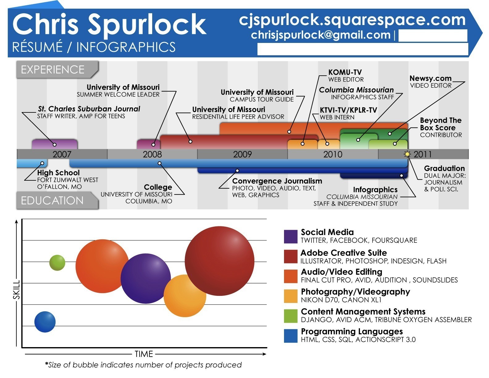
Vox's online editor told me about it as I was updating my resume. Internet sensations come to me a bit slower because I don't have a Matrixian news feed plugged directly into my spinal cord. Here is the resume in question if you haven't yet seen it:


In any case, just prior to looking at this, I had googled the phrase "cool resumes" for inspiration. The key word from here on out is inspiration. Lo and behold, on the first page of my search, I found this gem posted to an infographics blog more than a year ago:


I think it's very safe to say that Chris borrowed heavily from Michael Anderson's resume. Here is a somewhat exhaustive list of identical or near identical elements:

  • The general layout
  • The typeface and type treatment (Bold and Light all caps)
  • The color palette (this was revised in the final version of Chris')
  • The timeline format
  • The gray shaded bars behind the timeline
  • The callout style on the timeline with ruled circles
  • The labels for Experience and Education in color, type treatment and shape
  • The placement of all the contact information along the top of the resume
  • The star to designate graduation date

At this point, you might be asking why this matters. The transitive property does not give Chris Spurlock Michael Anderson's work experience. The content of the resume is presumably not a falsification. It would not matter if Chris were applying to be a social worker or a sandwich maker or an exotic dancer. In all those cases and more, this would just be a way to make his resume stand out. In journalism, however, the skills exhibited in creating this resume are relevant in several different areas. It suggests that Chris is capable of generating brilliant ideas, has wonderful design sense, can make a wicked infographic, and so on. These all might be true, regardless, but it essentially lying to employers to present this as his own work. He did not come up with the idea to present his career and education in this precise manner.

To me and several other visual journalists I've spoken to (some of the Vox designers and Missourian photo editors), this is clearly visual plagiarism. Every detail of Spurlock's resume is lifted directly from Anderson's. Had it been a matter of Spurlock seeing it once, remembering the rough layout and accidentally copying it, that might be more excusable. But in this case, each element is copied directly from the original with only minor, relatively insignificant departures.

In the process of examining the two resumes, I returned to the originating source: J-School Buzz Editor-in-Chief David Teeghman. He at first said that Spurlock's was different enough that it was not a direct copy, which I felt was untrue, but understandable for someone who admits to knowing nothing about design. I don't mean to sound self-important by any means, but as a designer, I feel the quality of work lies largely in my attention to detail. Type, layout, color palette, etc. are not snap decisions; they take a great deal of time and thought. When I explained that, as a designer, I felt this was untrue for the reasons listed in bullet points above, Teeghman responded that "To say this is plagiarism is like saying that Catch-22 is plagiarized from Huck Finn; yes, it's the same language and layout, but different in very important ways."

In general, this is a pretty confusing parallel. Book design and layout is pretty standard, by and large, and I don't think anyone in the history of academic dishonesty has ever considered using the English language as cause for dismissal. That said, I've only read all of Huck Finn and the first chapter of Catch-22, so perhaps I'm missing something. Perhaps Teeghman, married as he is to print, has a far more profound knowledge of American literature than I do. But that's neither here nor there. This asinine response elicited the rash suggestion that Teeghman does not understand design enough to speak to this, which, in turn, elicited a response from Teeghman that I do not understand plagiarism.

Evidently, Teeghman spoke with Mike Anderson, and Anderson assured him that it was not plagiarism. He gave Chris the green light after the fact, so everyone's sins are absolved. In following with Teeghman's Huck Finn analogy, I asked if it would be plagiarism if I had taken the novel and rewritten half of it while keeping the other half verbatim. In this scenario, I am claiming the work as my own with no credit to Mark Twain, but Mr. Clemens has so graciously given me permission to butcher his life's work.

To this, Teeghman responded "And yes, I would consider Mark Twain to be the eminent authority on what could be considered plagiarism of his own work. The creator of a work would know better than anyone else if another work had been plagiarized from his own work, or if his original had merely served as inspiration." I had hoped (wrongly, evidently) that I had given such a ludicrous example that Teeghman would be forced to see the error of his ways (more repenting cliches, etc.). In this case, plagiarism is not subjective. In my hypothetical, I took another man's work and claimed it as my own. The same holds true for Spurlock, though, in his defense, no one asked him, especially not Teeghman. It was not until last night that the J-School Buzz article included any reference to Anderson's original work, and considering the premise of the original article (the coolest journalism student resume ever), an acknowledgment of something that is only a couple years old seems necessary. But that would require a knowledge of or attention to events in the immediate and distant past.

It is alarming that the EIC of a website devoted to navel-gazing and the inner workings of the "World's Best School of Journalism" does not have a simple grasp on the concept of plagiarism. It would be more alarming that he does not make this a priority ("It's not that I feel strongly that I'm right, I just didn't really care enough to focus on it, because I have so much other work to focus on with the site.") considering that ideas are currency in journalism. But again, if you don't understand what plagiarism is, it's hard to fight against it.

Wednesday, February 23, 2011

Critique - week 5


This week I'll be critiquing my cover roughs for the True/False issue of Vox. The theme is WT/F? Or "What True/False?" As in, the who, what, when, where and why of True/False.


This was the first cover I created and my favorite of the three. I like it because it's very immediate and fun; it would have great newsstand appeal. Conceptually, it might be a bit fuzzier (to use a technical design term), but the general feeling I get with True/False is that we're essentially putting a silk hat on a pig. That is, Columbia is a very nice college town in the middle of Missouri. It's impossible to comprehend, therefore, how it came to host one of the top two or three biggest, most popular documentary film festivals in the world. It's loved by the directors (plug!) and the community alike, but Columbia is not Hollywood or Cannes or Venice. Columbia is an average Midwestern town the other 361 (362 in leap years, of course) days of the year. So I tried to evoke that disconnect or cacophony in the design. The type is derivative of something that was elegant but has been cheapened, and the color palette is just a little garish but still very pretty (I think, at least). This combines, of course, with the text to be very jarring in a positive way.


My second cover is essentially a more literal interpretation of that the concept I was trying to convey in the first cover. Here, the idea is that the acronym "WTF" has been spray-painted as graffiti onto a brick wall in downtown Columbia (where True/False takes place, primarily). The film of the festival is then projected onto the city to add culture, but the city remains part of the landscape. Execution-wise, this is rough, and would likely require actually painting a brick wall and photographing it or a more skilled Photoshop artist.


The final cover is my least favorite, and, therefore, it was everyone else's favorite. It bores me, and it was exceedingly simple to put together and conceptualize. My thinking behind it would be to emphasize the emptiness of the documentary director's chair as he or she is out-and-about rather than sitting in a studio. That said, people took the proportion of the chair to signify the importance of the director to the documentary process.

In each of the covers, I chose to not use sell lines because the T/F package deserves full importance. It is the biggest thing that happens in Columbia each year by a wide margin. Furthermore, as a city magazine, Vox has little value to out-of-town visitors for T/F for anything but our festival coverage. As such, cluttering the cover with extraneous info about swim instructors and gaming conferences would be less worthwhile than it usually is.


Don't Miss This vol. 5


Last week on Eye's blog (nothing this week really piqued my interest, sadly), they discussed the combination of infographics and music. These are not typical interactive web infographics, but moving infographics (video infographics, essentially) that use sound creatively. In their first example, the designer created a New York subway map in which the trains create cello string noises as they cross paths with other trains. (My words don't do it justice, so you should check it out here)

This relates to my post last week in which I discussed the expanded dimensions (and senses!) in which we as designers must think as we move our skills to the tablet format. Both examples Eye gives are brilliantly creative ways to express frequency of occurrence in a way that is more easily understood than a visual with many moving parts.

In other news, I'm a sucker for movie art. That's the last time I'll say that, I think. You all know by now. As such, I can't pass up a great opportunity to spread the movie love. This week, IFC.com created their list of the 50 Greatest Opening Title Sequences of All Time. The sheer volume of great options allows us the ability to compare the varied visual storytelling styles exhibited in each. Just for kicks, let's look at #41 Snatch and #40 The Shining.


The Snatch titles are energetic and playful, which parallels the frenetic pace of the movie and the humor of the script. Furthermore, the bold colorizations of each characters, and the interweaving scenes foreground the plot machinations of the movie and the cartoonishness of the characters.


On the other hand, the titles for The Shining are much more subdued. They're beautiful, and the score tells us we should be worried, yes, but they are not as frenzied as the Snatch titles. The storytelling and general insanity in The Shining makes a much more subtle entrance. Don't get me wrong, The Shining is not a subtle movie, but the progression is. For as much terror as we are led to expect, Jack doesn't exhibit anything more than a foul temper until his final rampage.

Incidentally, I do feel they left off the Rosemary's Baby titles, which are just as brilliant for their use of sound as they are for their visuals. Unfortunately, YouTube is coming up bare, so you'll just have to borrow it from me or rent it and see for yourself.

Response - week 5


This week, we watched The September Issue, which, along with The Devil Wears Prada, is one of the two movies Magazine graduates of the University of Missouri School of Journalism need to have seen. Somehow I managed to get my degree without seeing either.

Having now seen the former, I suppose I should first admit (and be embarrassed, apparently) that I had no idea the September issue of Vogue was culturally significant. As someone who would one day (sooner rather than later, employers) work for a major consumer magazine, this seems like something I'm just supposed to know. But as a man who cares more about every other facet of culture before fashion (consciously, at least), you'll have to cut me some slack.

In any case, I suppose I found the relationship between Anna Wintour and the creative director, Grace, to be the most fascinating because it was the most relatable. Obviously Vox is not Vogue, and our editor is not Anna Wintour, but it seems that Editorial as an entity has undue control over design elements of the magazine, whereas Design as an entity has little to no input on the editorial content. There is a comic that I saw a few years ago, but I couldn't find an image online, so my words will have to suffice. Essentially, it's a single frame of a man being executed in a guillotine, and as he pulls the cord to release the blade, the executioner says, "We prefer to call it editing." This was certainly evident in the production of the September issue of Vogue as it was evident when I was a reporter for Vox and now a designer. Of course when I was a department editor, I felt differently.

From a film perspective, the editing is troubling. As many times as it has been said, it bears repeating: a documentary is as much a product of the director as a fiction film. The content is shot and ultimately edited to tell the story the filmmakers want to be told, which is not necessarily the true story 100 percent of the time. This holds true for The September Issue, however the fictional effect is doubled when you consider the subjects. Every member of the Vogue staff, especially Anna Wintour, are media-savvy. After all, they're members of the media. And, after all, documentary is journalism. Wintour et al know what makes a juicy story, and they know how they want to be portrayed and perceived. It's difficult to say how much of the subjective material of the documentary is truly business-as-usual with this understanding.

All that said, there are also moments where the documentarians clearly embellish events through subtle filmmaking techniques. Three-quarters through the film, they weave the narrative of decline for both Anna and Grace together and suggest that both of them are tired of the monotony and constant struggle of their work. These interviews, of course, were recorded separately from the actual events, and their answers are answers to intentional questions. The implied simultaneity of these moments is entirely fabricated. Furthermore, when Wintour listens to one of the staff member's story pitches, the audience is led to believe that Anna is disinterested and tired, when in fact there is nothing to support this. The effect is created entirely by cross-fading the diegetic sound of the meeting room with the non-diegetic sound of depressing music.

Because of all this, it is difficult to decipher what is and isn't true about Anna Wintour's grip on Vogue. We understand that she is very powerful, but we gain little insight on her personality.

Wednesday, February 16, 2011

Critique - Week 4


My publishers and I are getting started working on our new prototype, Thrifty Cook AKA Cupboard, or, as I like to call it, whisk + pantry. It's a play off Town & Country, which is a lighthearted jab that people in our target age group would appreciate. It also incorporates the two key elements of the magazine: saving money and cooking. In any case, here are my first drafts of the cover, a department, a feature spread and the color palette. Have at it.


This is the cover, which I liked a lot more when it was just the photo and the logo. I initially had tilted boxes behind the sell lines (like the box behind the logo, more or less), but they were clunky, so I eliminated them. Unfortunately, this required using outer glows on the sell lines for legibility, which I think detracts from the flat aesthetic of the logo. As I'm sure you know by now, I really like flat. My biggest struggle with this project has been picking typefaces that reflect the purpose of the magazine, which is essentially to save money on food by making it at home and making less. As such, I tried to go with a handmade feel without being overt. The tagline is handwritten, but the title of the magazine is just a blocky, slightly rounded serif. The initial type I chose for the sell lines was basically the same used in Real Simple's logo, but there was a disconnect between the logo and the sell line style. The new type isn't a dramatic departure from the original, but I do feel that it's a bit friendlier and less modern.


For my department page, I tried to carry over some of the paper-scrap aesthetic from the logo with the tilted color elements as well as the icon-style department header. Because the magazine is an offshoot from a cookbook and is meant to teach readers how to cook for one or two people rather than eight, I felt sections such as "Resized" would be helpful and easy content to produce. The notion is simple: Take an item from the original cookbook and cut down the portions and ingredient count. Instead of feeding 10, it will feed two, and instead of requiring eight ingredients it will only require five, or something like that.

The second story on the page, "Leftover Redux: The Virtues of the Baked Potato," displays a recurring visual style in the magazine. Again, the premise is that the readers will be cooking for one or two. The potato here is blown up much larger than it would typically be with the idea in mind that just because you're cooking small doesn't mean you have to eat small. That is to say, the quantity is smaller, but the taste is not.


This is a sample feature, and, shall we say, it's a very, very rough draft. I was rushing to complete this element, and it shows. The story would be about how cutting coupons is a thing of the past, and coupons have all gone digital. I actually do like the concept behind the illustration. It's clean, and it reads pretty well. That said, the spread is pretty underwhelming, and I'll have to put more work into a revision. In short, I like the illustration concept and the headline type treatment, but I don't think I'd read the story based on this design.


Last but not least, here is the color palette for whisk + pantry. I wanted to go with a muted set of colors because the magazine is targeted toward young people who live alone or with one other person and have limited funds. Let me explain (or sum up, whichever you prefer). This isn't to suggest that these people live dreary, drab and depressing lives. It is my assumption that many of the readers live in old apartments in big cities, and their living space would not be as opulent and luxurious as those readers who don't have to worry about what they spend on food (or cooking at home, if at all. They probably have butlers, right?).

Again, feel free to tear this apart. I think it's a good starting point, but it's far from a finished product.


Response - Week 4


Mag+ from Bonnier on Vimeo.

This week, Mike Haney spoke to the Vox staff via Skype about a relatively new product, Mag+, that can be used to export designs from InDesign to the iPad. I don't have an iPad (read: $499 floating around), and I haven't extensively used any loaners to this point, so I'm not particularly well versed in what a magazine on the iPad should be able to do. That said, I was very impressed with the InDesign plug-in, and I look forward to learning how to create interactive designs with it. Based on what I took from his presentation, Mag+ essentially eliminates the need to know how to program an iPad app with pretty extensive functionality. That's not to say it cuts out the middle man entirely — I'm sure further customization is ideal for any publication — but it's certainly comforting to know that a designer is creating their issues, not a programmer. It seems like Mag+ democratizes iPad use and allows great design to flow directly from print to digital.

What Mr. Haney explained was that Mag+ functions in many of the same ways as print designing; you work from an InDesign template and determine which visual elements should compliment which parts of the text. The added freedom of interactivity, video and a fluid space is, of course, also an added challenge. But it's a challenge that I cannot wait to undertake. As the designer, this feels to me like it must have felt to directors in the late 20s/early 30s who used sound for the first time. It's an entirely new dimension of the reader experience that requires exponentially more planning and thought.

I'm very eager to start.

Can't Miss This vol. 4

As much as I would love to regale you all with my love of Saul Bass once again (in response to Eye's latest post about his work), I wouldn't want to bore you all too much. Instead, I'll be discussing their interview with Nick Felton, author/designer/subject of the Feltron Annual Report. (aside: why the R? That's just confusing)

The popularity (relatively speaking) of the Feltron Report is indicative of how much people prefer visual storytelling and the need for great design work. Many people, myself included, jump at the opportunity to read an intelligently made, witty infographic before a story told in a traditional words-first format. It is abundantly clear that charts, graphs, etc. (at least opposed to a narrative) are the only way to relate the information in the report without boring readers. For those unfamiliar, first let me apologize for making you wade through this paragraph with no idea of what I'm talking about. The report is Felton's statistical representation of everything that has happened to him in the past year, and it includes tons of small, fun details that would be dreadful to read were they simply written out. At the risk of sounding illiterate, may I just say that pictures really do matter. In any case, infographics can be one of the best, most accessible ways of telling stories because they use a good economy of storytelling techniques.

As an example, when I worked infographics for The Missourian, we created our own Feltron reports. At the same time, I was a department editor for Vox, so I essentially lived in the building (which was good because my house did not have air conditioning, and it was a typical Missouri summer). As such, my two-week report was dictated by Vox. Enjoy:


It's not quite as polished as I'd like, but, in my defense, I was a words person at the time. As you can see, this is a much more entertaining (I hope) and horrifying representation of my life at the time. Certainly you'd rather look at this than read a journal in which I catalogued my sandwich consumption habits on a given day.

But wait, there's more!

While facebooking this afternoon, I stumbled across Eric Skillman's design blog. Specifically, I came across his walkthrough of the creative process behind developing DVD case and menu screen art for the Criterion Collection. The draft process behind arriving at a final product totally fascinates me, because at Vox, our schedule is so tight that we typically cannot completely overhaul the concept, type and layout of a feature design. Here he discusses the changes behind the DVD art for Broadcast News and how each design variation moves toward or away from the content of the movie. He has designed several of my favorite Criterion covers, including Divorce, Italian Style and Seduced and Abandoned (both commedie all'italiana, dir. Pietro Germi).

In an earlier blog post, he also discusses the design process for another favorite, Sweet Smell of Success. In this case, he collaborated with an artist rather than using photographic art from the film (as with Broadcast News). This post is fascinating because he talks about design that is both content-driven while also limited by requirements placed on the design. What results is a beautiful, brilliant cover. I'm so glad the cover employs the primary color palette of the movies at the time both because the movie posters of the mid-20th century are my favorite, but also because it suits the movie so well.

Also because it's a dramatic improvement over the current offering, which reminds me another reason why I like Criterion so much. Much like Polish movie posters, Criterion's designers frequently make film art that is not directly associated with previous promotional materials for the movie and instead are a much better, content-driven representation of the film.

Wednesday, February 9, 2011

Response - week 3


In reading William Owens' Modern Magazine Design, I was struck both by how many design styles I took to be fairly modern innovations have, in fact, been around since almost the beginning, as well as by how early magazine design began to evolve and grow from newspaper and book design. Although this example from the December 2010 issue of Esquire does not adhere to many of the punk style elements of the '70s and '80s, it does use and reinterpret several. Owen explicitly notes both the use of typewriter type rather than digitally set type as an element of punk as well as a renewed appreciation for pop art. Although surely Esquire set this typewriter type with a computer, the intent is the same; it defies the standard of beautiful design in favor of a found aesthetic. Similarly, the photos look unremarkable to fit in with the desired style, and they are not given dominance over the text as they would be were this a standard, modern design in many consumer publications. Instead, they are written on and placed haphazardly on the page. Even though punk used mismatched type, the DIY look of the handwritten type in this spread follows a similar train of thought. The hand-drawn sketches in conjunction with the display type and highlighter accents create the image of a sketchbook rather than a slickly designed magazine. Although Esquire is certainly not calling directly upon the punk style of design, the visual elements of this spread can be seen as an evolution from it, if a highly commercialized version (which is confusing).

Don't Miss This vol. 3


It's all coming full circle, pun soon-to-be-not intended. This week, Eye stole my thunder and discussed movie title sequencesDr. No and Vertigo to be precise. As you might have guessed, I love title sequences when they're done well. In the blog post, Eye's author analyzes how the titles forecast the content of the movie and tone of the movie. Dr. No, being a Bond (based on the tone and content of Hitchcock's North by Northwest), is light and dynamic. Vertigo is much more complicated (than just about every movie in just about every way, but that's another discussion altogether). The titles are superimposed over a woman's face, which lays the groundwork for the movie's discussion of voyeurism/scopophilia and what Hitchcock didn't know at the time would be called The Male Gaze. For those who haven't seen Vertigo, first of all, borrow it from me. You might not (probably won't) like it, but I do. A lot. Secondly, one of the major points of the film is that Scottie (James Stewart) is obsessed with a woman (Kim Novak) and follows and watches her; he falls in love with the image of her. Later in the film, after SPOILER ALERT she dies, he searches for her replacement and ultimately reshapes that woman to fit the exact visual mold of the first. This is all relevant because the design of the titles informs the learned audience member (film scholar, even) that these themes are of utmost significance to the movie. Furthermore, the Vertigo titles are significant because, despite their seemingly cheesy spirograph effect, they employ an early form of the psychedelic aesthetic that is echoed (cheesily, again) later in a dream sequence. Although it might seem poorly done, keep in mind that Vertigo was released in 1958, about a decade before the psychedelic look took hold.


This discussion segues nicely into my love of Saul Bass. He and Hitchcock are probably the two visual storytellers I admire most (although Stanley Kubrick has certainly moved up the ladder). The two men collaborated on the visuals of several of Hitchcock's films, including the aforementioned Vertigo and North by Northwest as well as Psycho. He is probably most famous for his Anatomy of a Murder poster, for which he also designed the opening titles.


I love the flat graphic style that he uses in this and many of his other title sequences and movie posters. It is singularly his and a beautiful example of pop art that (in my opinion) clearly draws at least a little bit from other highbrow artists such as Matisse and Rothko.


I also love the titles to Charade, which Saul Bass designed:


And the Catch Me If You Can titles, which draw upon a similar style to Bass':

Critique - Week 3


In light of our new logo project, I thought I would critique an old logo prototype for the Terrafugia Transition. There were several elements to consider in creating this logo, and it required me to think as an advertiser rather than a journalist. With logos, we are defining the visual branding of a product or organization, and the style needs to appeal to the target consumer or affected audience. In this case, the Transition is the world's first roadable airplane, which can be referred to colloquially as a flying car because it can both drive roads and fly. The target market was very, very wealthy, middle-aged men who enjoyed recreation and aviation. In my logo, I tried to reflect the freedom provided by the vehicle by giving a flightless bird (the body is modeled after the Looney Toons road runner) the flighted wings of an eagle or hawk. Below is a close up of the logo:


Initially, the two legs were much larger in an effort to create a T shape of the body to go with the F shape of the head for Terrafugia, but their size was reduced in order to create a more logical scale for the legs. Furthermore, I de-emphasized the T and F because it was not as strong a visual puzzle as needed to be memorable (as with the Fedex logo). I also gave the wing a more streamlined look (in a previous draft it was more curved and elongated with curved white lines rather than the straighter ones in the final version) to suggest the futuristic nature of the vehicle.

There were a few key concepts I was grappling with in creating the logo. The primary motivation behind the logo and subsequent ad campaign elements was the concept of freedom. The vehicle allowed maximum freedom; you can literally get up and fly at will because you have an airplane parked in your garage. As such, the bald eagle imagery and color palette were emphasized in the logo because it is a bird that most Americans directly associate with freedom and masculinity. After that, there was the necessity to suggest the actual product with the logo, which is accomplished through the pairing of a bird with a tire (the legs form a tire in a subtle-yet-not-subtle way). The logo also had to convey that the product was futuristic but also luxurious. Instead of turning to '80s sci-fi fonts and The Terminator, I looked instead at high-end car logos (specifically Ferrari and Cadillac with the ducks). The end result is sleek without being finicky. That is to say, it's not feminized in any way (in my opinion, obviously).

Another consideration that is important from an execution standpoint is the varied uses of the logo. If this is to be used in print media (in magazines as well as business cards, letterheads, etc.), it had to be scalable (clearly distinguishable even when made smaller) and look nice in print. As many of my fellow designers are discovering, the image on the screen is always better and more vibrant than it is in print. Depending on the type of paper, quality of printer, etc., the vibrancy and contrast of a screen-friendly logo can be minimized, so dual-use design is a must if it is be used in both print and digital media.

Friday, February 4, 2011

Don't Miss This vol. 2A


I have often said that the first thing I would do if I won the lottery would be to buy movie posters. And, although I am frequently sarcastic, on this topic I am very serious (as a heart attack, you might say).

My current obsessions are the alternate Black Swan posters, which are breathtakingly exquisite. Before I saw (and loved) the movie, I had to have these posters. They're beautiful and devilishly smart, which is not to say that the standard poster is not also quite incredible, just that these are wholly remarkable. I would have been shattered if the movie had been so offensive to my tastes that I could not bring myself to purchase the posters. If anyone is looking to buy me a birthday present (March 3rd, just sayin'), a gift of any of these posters would be met with tears of joy and speechlessness. I've said enough, here they are:

In other poster news, I bought the poster for The Warriors today after the snow acted as catalyst for a screening with my roommate. I enjoyed it the first time I saw it and this most recent screening. My roommate was similarly enthralled and, upon learning that it was based on the Greek myth Anabasis, has decided to write an action movie screenplay based on the Norse myth of Ragnarok. I can't wait. Either way, here is the poster that I purchased today:

It's simple, and I'm not sure whether it was given a lot of thought (although the painting is quite detailed). I just find the style to be very appealing in that it's much cleaner and less flashy than today's movie posters. The tag at the top reads, "These are the armies of the night. They are 100,000 strong. They outnumber the cops five to one. They could run New York City. Tonight they're all out to get the Warriors." It's a brilliantly succinct summary of a brilliant premise for a movie. It isn't done up with bells and whistles (e.g. "You just killed a helicopter ... with a car!"), but it works very well for what it tries to accomplish. We gave it five stars on Netflix.

At the poster sale, I asked the cashier if they had the one-sheet French Lolita poster that they used to sell. I have one in my apartment, but Lando (Catrissian), my roommate's cat, tore off the corner. The cashier said they didn't carry it anymore, but commented that my Warriors poster was a similar time period. Historically, culturally and certainly cinematically, 1962 and 1979 are dramatically different time periods. The same holds true for design, but that's another blog post for another day. That said, it's a good segue into my other most coveted movie poster at the moment: the Italian Lolita poster. The French version I have is the standard "How did they ever make a film out of Lolita?" poster with the heart-shaped sunglasses and the red lollipop. The Italian one, however, is dramatically different and enthralling.

The text is the first line of the first chapter (as I recall). In Italian, it reads:

Era Lo,
Null'altro che Lo
Al mattino
Dritta nella sua statura
Di un metro e cinquantotto
Con un calzino soltanto.
Era Dolly
A scuola.
Era Dolores
Sulla linea punteggiata
Dei documenti.
Ma nelle mie braccia
Fu sempre Lolita.

For whatever reason, the poetry of the Italian language (as my old Italian professor described it) makes this line much more dramatic than the English version of Nabakov's words (which is obviously a hard feat).

I'm done gushing over posters for now. Check in later for more.