In this week's installment of Can't Miss This, I'm taking a look at Eye magazine's discussion of the poster on the Piccadilly line in London. The writer loves the poster, and explains that it makes riding that leg of the tube much friendlier and helpful because it places the line in the context of above-ground London.
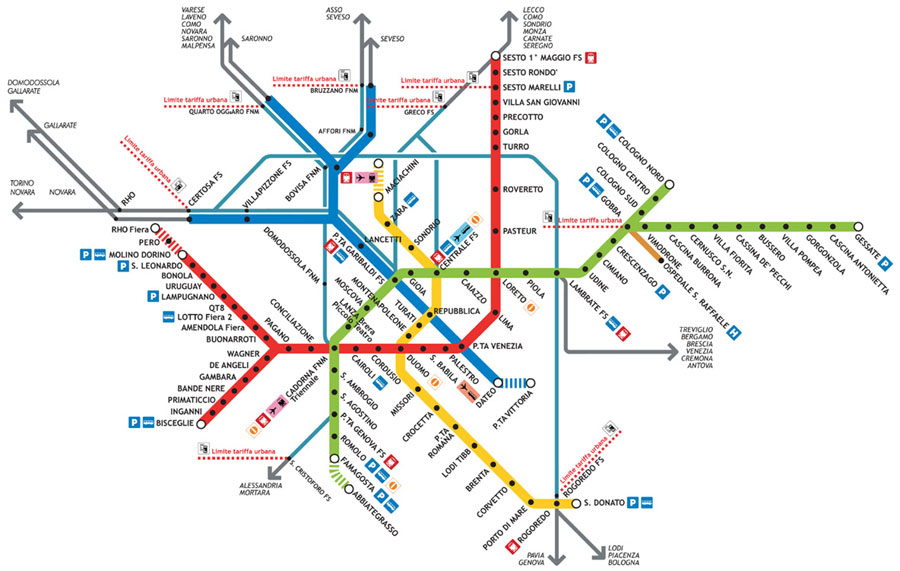
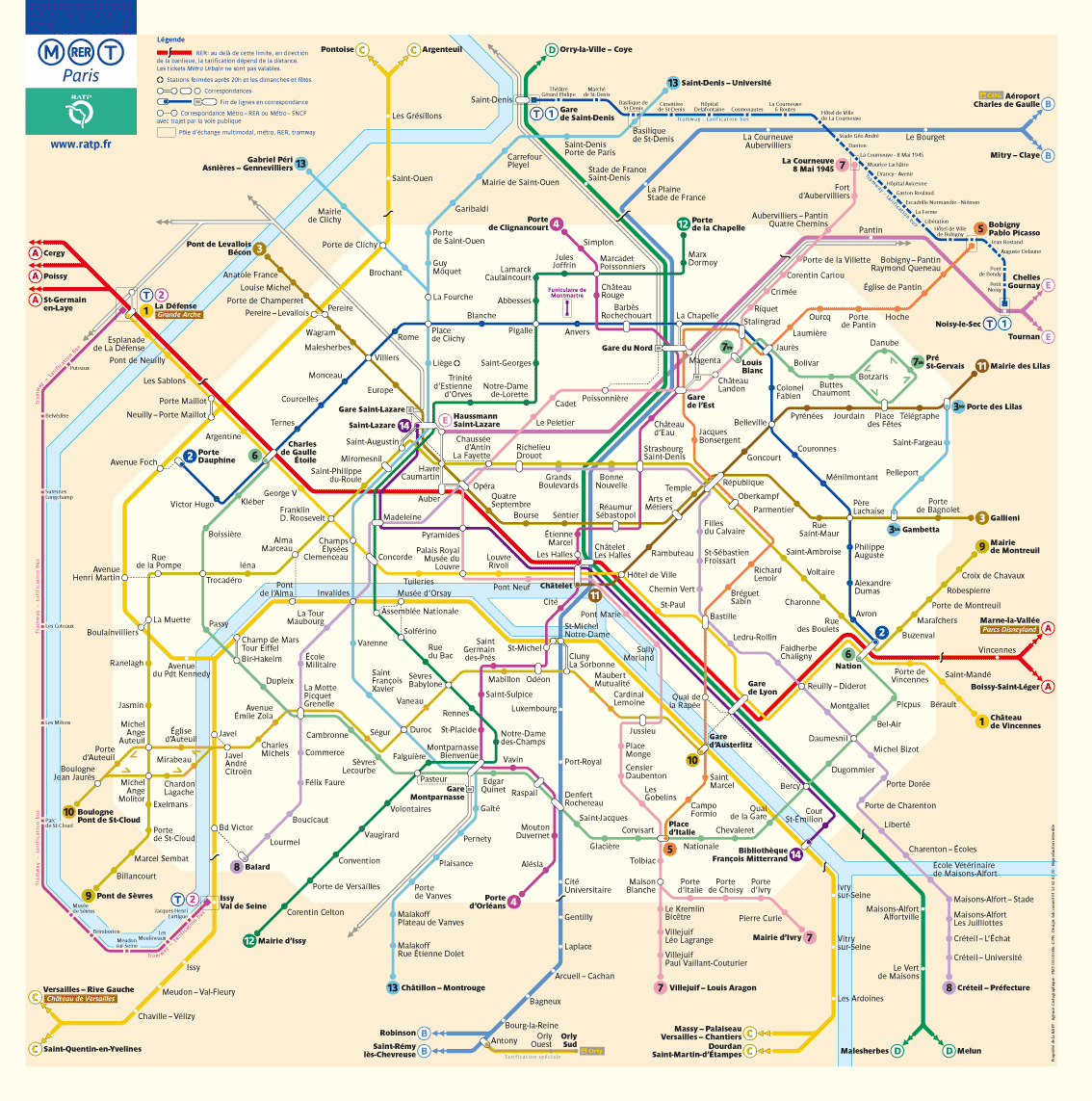
Although I understand her perspective, I have to disagree. To me, it looks a few steps up from a standard, tacky tourist map, and it seems very cluttered from the images posted on the blog. The beauty of public transportation maps, and I'm assuming the Piccadilly line also follows suit, is how similarly they explain the same information. In my time studying abroad in Italy and travelling through Europe, I was able to navigate any city easily because, by and large, subway maps are all the same.
Milan:
Paris:
London:
Berlin:
Being from Chicago (Skokie, actually), these maps make complete sense to me even if I don't speak the language (I'm looking at you, German) because they look and function just like the El maps in Chicago.
Information graphics should function first as information and secondarily as art. The beauty of these public transportation maps is their sameness. They all transcend language and communicate visually in a way that all people who know cities can understand.
On a less serious note, during the past couple days of snowed-in-ness (I'm phoning the Oxford dictionary people right now to petition for snowed-in-ness to be considered part of the English language), I've had a chance to bum around and Netflix the hours away with my roommate. This evening, we stumbled upon the 1991-92 season of Saturday Night Live (which, incidentally, had a powerhouse cast, including Mike Myers, Chris Rock, Dana Carvey, Chris Farley, Adam Sandler, Kevin Nealon and others), and the opening sketch was Wayne's World, in which Wayne and Garth analyzed the "Best and Worst of the Summer of '91." Included in this was the Best Magazine Cover.
Wayne: Best Magazine Cover. Demi Moore on the August Vanity Fair. We applaud her for her tasteful display of natural beauty. We thought it was very appropriate.
Wayne and Garth: [in unison] NOT
Wayne: Hey, hey, hey Demi Moore, how 'bout a little Demi less? I mean, we don't have to see it.
Garth: No offense, or nothin', no offense or nothin', but she uh, she uh looked pregnant.
Wayne: You have an astute command of the obvious.
The cover they're talking about, of course, is the famous VF cover with a nude, pregnant Demi Moore pictured below:
As designers, I feel it should be our goal to at least once have a cover we design get made fun of on SNL. I know it's one of mine. That said, if we're getting too much national attention, we're probably not doing a good job.


No comments:
Post a Comment